6.1 KiB
Step 3: add a toolbar button
(Estimated time: 30mn)
It's time now to implement the logic of our new activity.
Because the activity is called "Pawn", the idea is to allow user to play pawns on the board.
In Sugar, the toolbar - the black area at the top of the window - is the place where activities put actions for the user. So we will add a new button in the toolbar to let the user play a new pawn.
Create a new toolbar button
Here is the icon we will use. It's just a stylized plus sign.
You could download it here. Right-click on it and then save it as a SVG file in icons/add.svg.
Warning: The plus sign is white on a transparent background so you will see nothing if you display it on a white background.
To add this icon in the toolbar, we will first update the index.html file for your activity. Look for the toolbar section in the file. It looks like this:
<div id="main-toolbar" class="toolbar">
  <button class="toolbutton" id="activity-button" title="My Activity"></button>

  <!-- Add more buttons here -->


  <!-- Buttons with class="pull-right" will be right aligned -->
  <button class="toolbutton pull-right" id="stop-button" title="Stop"></button>
</div>
Let's add our new button. It's just a button tag with the Sugar-Web toolbutton class. We give it the value add-button for the id property. Here is the result:
<div id="main-toolbar" class="toolbar">
  <button class="toolbutton" id="activity-button" title="My Activity"></button>

  <!-- Add more buttons here -->
  <button class="toolbutton" id="add-button" title="Add pawn"></button>

  <!-- Buttons with class="pull-right" will be right aligned -->
  <button class="toolbutton pull-right" id="stop-button" title="Stop"></button>
</div>
We will now associate the icon to this new button. This association should be done in the css/activity.css file. Add these lines at the end of the file.
#main-toolbar #add-button {
    background-image: url(../icons/add.svg);
}
Let's run the activity.
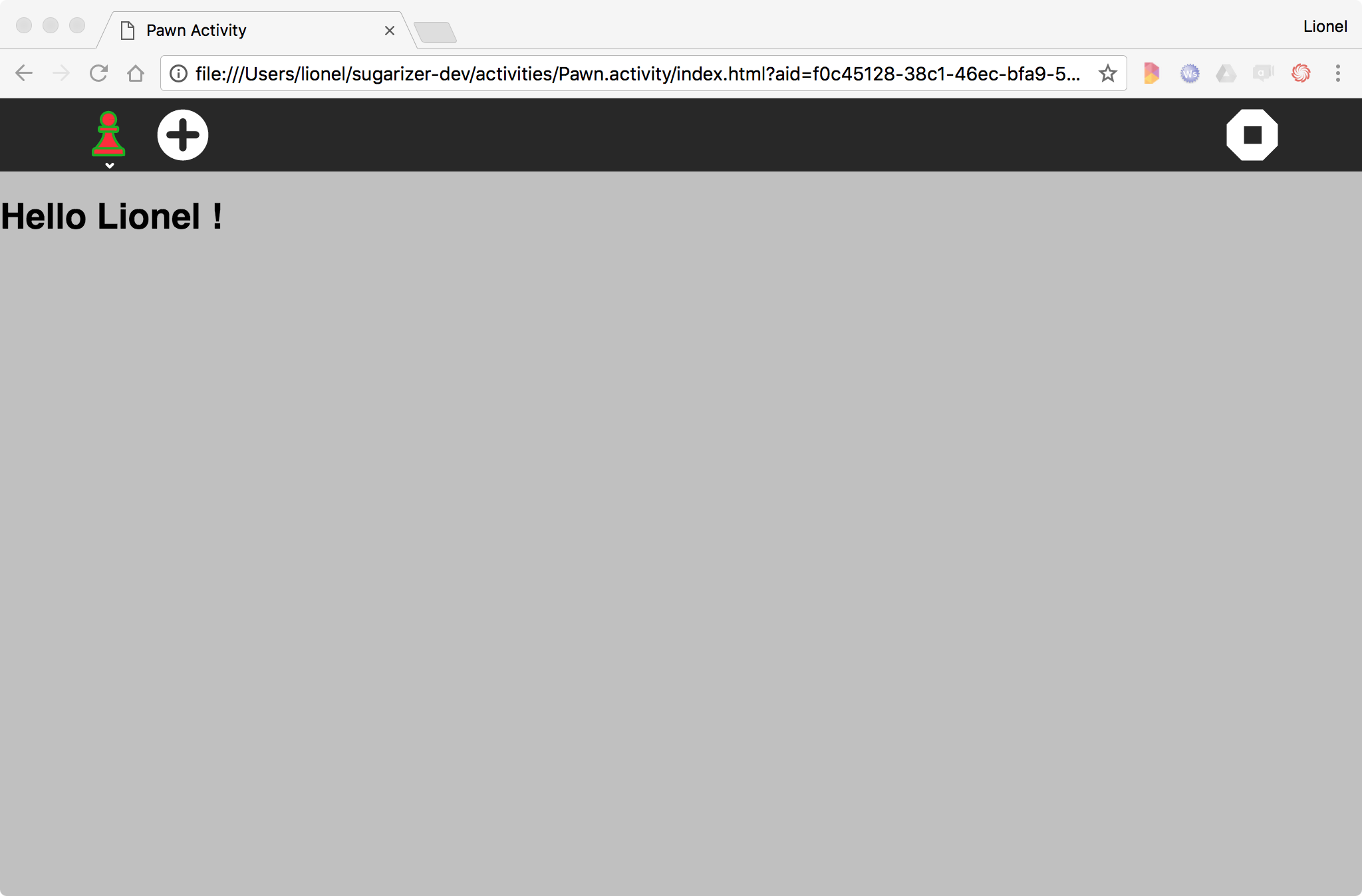
The new toolbar button is now here. Click on it. Of course nothing happen thought there is no logic beside. It's our next step.
Add the event
To display pawns on the board, we will first update our index.html file.
Add a new div tag below the one created for the welcome message:
<div id="user"></div>
<div id="pawns"></div>
We give the value pawns for the attribute id because it will contain all pawns on the board.
To draw the pawn we will reuse our nice pawn icon. So each time there will be a click on the Plus button, we will add a new pawn icon on the board.
Let's update the activity/activity.js to add this. But first, we will slightly adapt our getEnvironment call. We just add a currentenv variable to store the environment to avoid multiple call of the getEnvironment method:
    // Welcome user
    var currentenv;
    env.getEnvironment(function(err, environment) {
        currentenv = environment;
        document.getElementById("user").innerHTML = "<h1>"+"Hello"+" "+environment.user.name+" !</h1>";
    });
Then just after the getEnvironment call, we will add the following event listener:
    // Handle click on add
    document.getElementById("add-button").addEventListener('click', function (event) {
        var pawn = document.createElement("div");
        pawn.className = "pawn";

        document.getElementById("pawns").appendChild(pawn);

        document.getElementById("user").innerHTML = "<h1>"+currentenv.user.name+" played !</h1>";
    });
This source code does three things:
- Declare a new event listener to add an action on the click event for the HTML element with the
idvalueadd-button, i.e. our toolbar button - Create a new
divelement with theclassvaluepawnand append this element as child of ourpawnsdiv - Update the welcome message to indicate that a new pawn has been played by the user
Make sense? Yes, except that something is missing: the link between the div created for the pawn and the pawn icon itself. To do that we have to update the css/activity.css file. Add these lines at the end of the file:
.pawn {
  background-image: url(../icons/pawn-icon.svg);
  display: inline-block;
  width: 65px;
  height: 65px;
}
It defined a new CSS class named pawn, give it few cosmetic properties and specifically our pawn icon as background.
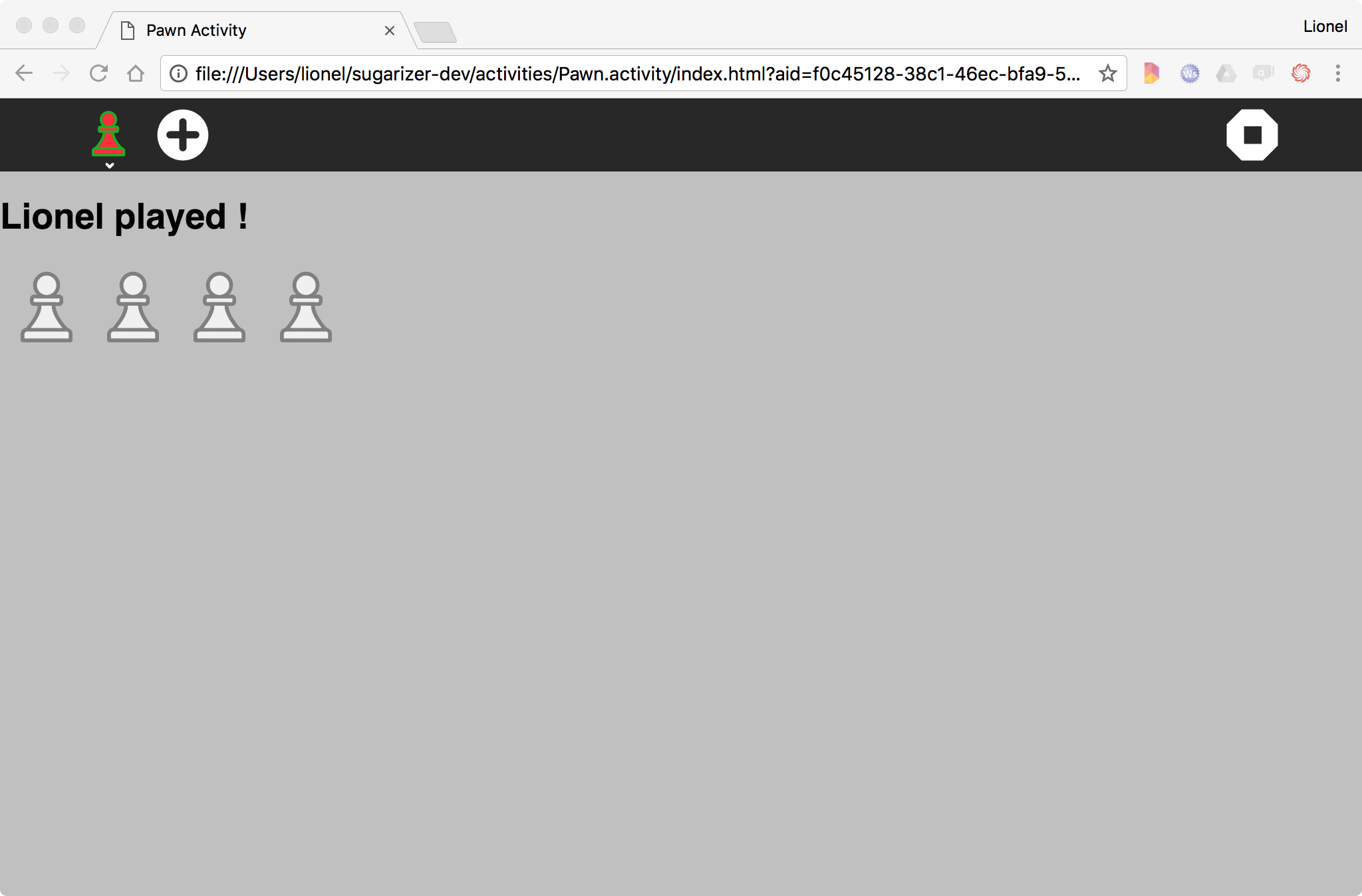
Can't wait to run again our activity:
Wow, it works! Each time we will click on the Plus icon a new pawn will appears.
By the way, we could do better. What if we could change the pawn color?
Customize again the icon
Sugar activities very often rely on the user colors. It's a way to let the user think he could customize the color of activities. So, it's a good way to better engage him into the activity.
We decide to update our activity to paint the pawn with the user color. You could think it's complex: it's not! Just a call to another Sugar-Web library named icon.
Let's reopen our activity/activity.js file.
We will first add the reference to this new library at the begining of the file. Update the first line with:
define(["sugar-web/activity/activity", "sugar-web/env", "sugar-web/graphics/icon"], function (activity, env, icon) {
We have now three dependancies: activity, env and icon.
The icon library contains a magic method called colorize. Just give it a reference to a Sugar-Web icon and a color and it will transform the background to a colorize icon.
Let's add a call to this magic method just after the appendChild call:
document.getElementById("pawns").appendChild(pawn);
icon.colorize(pawn, currentenv.user.colorvalue);
Very simple, we call the method with two parameters: the new pawn element and the user color that we could find in the environment.
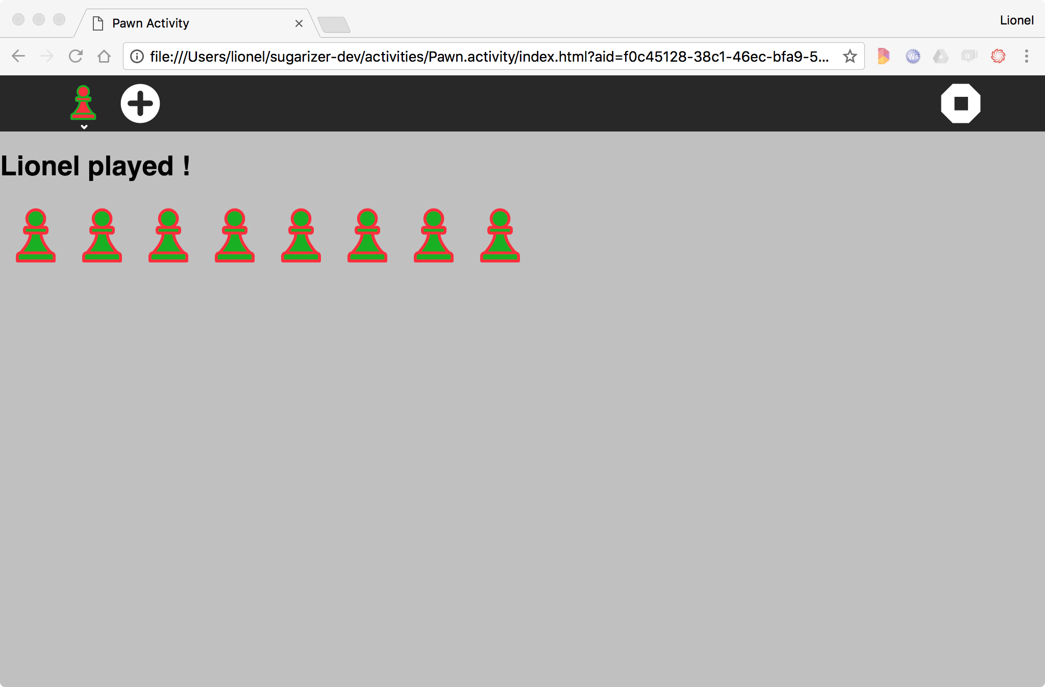
That's all. Let's play again with our activity:
Beautiful isn't it?
Note that if you're interested by how to integrate the Sugar UI in your activities, you could find more samples on this subject here.


