[Go back to tutorial home](tutorial.md)
# Step 8: Create your own palette
*(Estimated time: 15mn)*
Step after step we've added icons in the Pawn activity toolbar. In this new step we're going to improve our toolbar by exploring the creation of "Palette".
In [step 6](tutorial_step6.md) of this tutorial, we've added a specific icon in the toolbar for the "Presence Palette". In the Sugar UI, the name "palette" refer to a popup menu in the toolbar. When the user click on the toolbar icon, the popup appears and shows items inside.
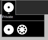
As we've seen briefly in [step 6](tutorial_step6.md#add-the-presence-palette), to handle this feature Sugar-Web exposes a Palette library. Let's see how we could use this library to create our own palette.
### Create the palette file
To create a new palette, you should first create a new palette file. This file will contain the source code to handle palette behavior.
So, create a new file named `pawnpalette.js` in the `Pawn.activity/lib` directory.
***Warning***: *The file should not be created in the `Pawn.activity/src` because palettes are considered to be new libraries.*
Here's the source code to insert into the new Pawn palette file:
define(["sugar-web/graphics/palette"], function(palette) {
var pawnpalette = {};
pawnpalette.PawnPalette = function(invoker, primaryText) {
palette.Palette.call(this, invoker, primaryText);
var template = 'Hello palette!';
var containerElem = document.createElement('div');
containerElem.innerHTML = template;
this.setContent([containerElem]);
};
var addEventListener = function(type, listener, useCapture) {
return this.getPalette().addEventListener(type, listener, useCapture);
};
pawnpalette.PawnPalette.prototype = Object.create(palette.Palette.prototype, {
addEventListener: {
value: addEventListener,
enumerable: true,
configurable: true,
writable: true
}
});
return pawnpalette;
});
As we've already seen in [step 2](tutorial_step2.md#customize-content), the `define` function is a way to define a new module and express its dependencies. Here we're going to define a new module that depends on the JavaScript library `sugar-web/graphics/palette`. This `palette` library is precisely the base class for all Palette objects.
So, our new module create a new `PawnPalette` object and initialize it by calling the Palette constructor with `palette.Palette.call`.
You don't need to understand in detail how it works but the important part here is that the Palette content should be set by a call of the `palette.setContent` function.
Here, the content is just a HTML div element with a simple string `'Hello palette!'` inside. In most complex palettes, the content could come from a HTML file or could be a generated set of items.
### Integrate the palette in toolbar
Let's now integrate our new palette in the toolbar.
It could be done by adding a new button in the toolbar like we've done in [step 3](tutorial_step3.md#Create-a-new-toolbar-button). But here we're going to redefine the behavior for the current **Add** button instead.
To do that, let's update our `js/activity.js` file.
As usual, to integrate new features, we will first update the dependancies list of libraries at the first line of the file.
define(["sugar-web/activity/activity", ... ,"sugar-web/graphics/journalchooser","pawnpalette"], function (activity, ... ,presencepalette, datastore, journalchooser, pawnpalette) {
This time you need to add the `pawnpalette` library created before. Add the string `"pawnpalette"` at the end of dependancies array and declare a new `pawnpalette` variable at the end of the function declaration.
Let's now create the palette and associate it to the icon. Add the following code just before the `addEventListener('click',...)` call for the add button:
var addpalette = new pawnpalette.PawnPalette(document.getElementById("add-button"), "Add pawn");
This source code call create the `PawnPalette` object and call the constructor with two parameters:
* the first one is the toolbar button to associate the palette. As we said, we're reusing our **Add** button.
* the second one is the header for the palette. It's an optional parameter used to display a label at the begining of the palette to explain the palette objective to the user. Here we set `"Add pawn"`.
Let's run the Pawn activity. Now, when you click on the add toolbar button the palette is displayed.
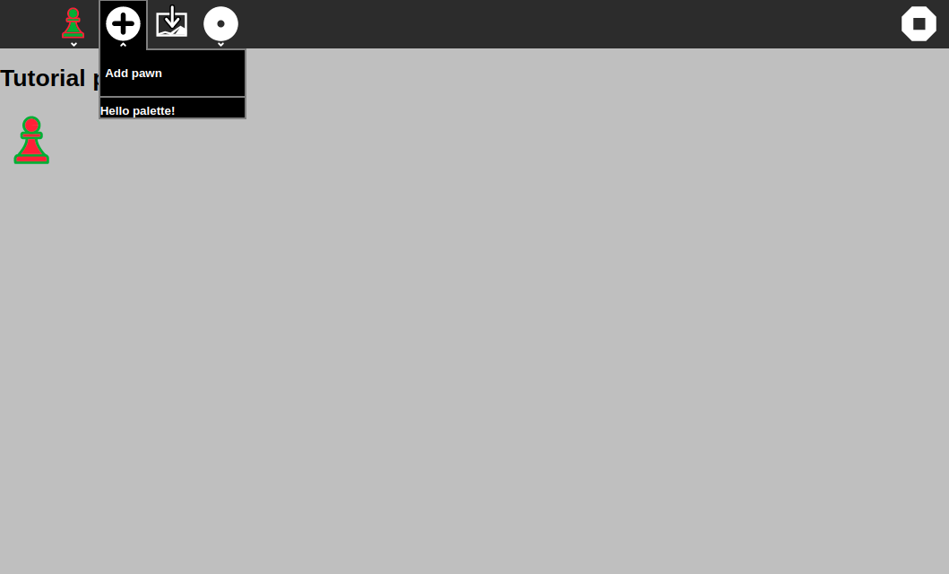
Funny isn't it?
As an exercise, look what happens when you do not provide a second parameter to the constructor.
### Customize the palette content
Now that we've seen basic concepts of palette, it's time to improve the UI for our custom palette.
Specifically, we're going to update our palette to allow users to add between 1 and 3 pawns at the same time.
Here's the final look we would like to obtain:
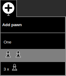
We would like to have 3 items each one that give opportunity to users to add a different number of pawns. To explore palette features each items will have a different UI: a text, an image, a text and an image combined.
To do that, we're going to use a HTML file to describe the palette UI. So let's create a new file named `pawnpalette.html` in the `Pawn.activity/lib` directory, at the same place of the `pawnpalette.js`.
Put the content above in this new file:
One
3 x 
It create three `div` elements, each one represent an item and its specific UI. The HTML tags are linked to some new CSS styles. So add to the existing `css/activity.css` file the following content:
.palette-item {
width: 200px;
height: 30px;
padding-top: 15px;
padding-left: 10px;
}
.palette-item:hover {
background-color: #808080;
}
.palette-icon {
width: 30px;
}
.palette-text {
vertical-align: super;
}
.item-icon {
padding-top: 3px;
height: 40px;
}
Then we need to update the palette source code to use this HTML file as template for the palette.
First, let's update the first line that define the module. We're going to add a new dependancy on the `pawnpalette.html` file. Here's the line once updated:
define(["sugar-web/graphics/palette","text!pawnpalette.html"], function(palette, template) {
The `text!` prefix before the file name tell to **require.js** framework to process the file as text content instead of JavaScript.
Then, because the `template` variable is now initialized by the `define` function, you could remove the line:
var template = 'Hello palette!';
That's all. We're now ready to display our customized palette.
Let's try by running the Pawn activity again.
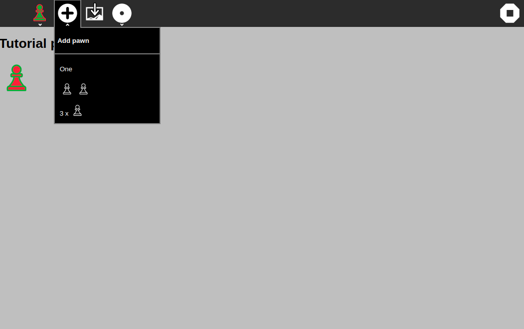
Waoow. Very beautiful!
### Handle palette event
From the begining of this lesson, the event handler for the **Add** button is still the same. So, when you click on the button to open the palette, a new pawn appear. And when you click again to close the palette a new pawn appears again. Of course, it's not the expected behavior. It's why we need to change the event.
The first thing to do is to create a custom event for our palette. This event will be raise by the palette when the user will click one of the three items. Here's the source code to do that:
this.pawnClickEvent = document.createEvent('CustomEvent');
this.pawnClickEvent.initCustomEvent('pawnClick', true, true, { count: 0 });
This code should be add in the `pawnpalette.js` file, just after the `setContent` call. It will create a new HTML Custom Event named `pawnClick` with a parameter `count` set to 0 by default.
Then let's set the event handler for our three items. Following is the code to do that. You should add it below the previous one.
var that = this;
document.getElementById("item-one").addEventListener('click', function(event) {
that.pawnClickEvent.count = 1;
that.getPalette().dispatchEvent(that.pawnClickEvent);
});
document.getElementById("item-two").addEventListener('click', function(event) {
that.pawnClickEvent.count = 2;
that.getPalette().dispatchEvent(that.pawnClickEvent);
that.popDown();
});
document.getElementById("item-three").addEventListener('click', function(event) {
that.pawnClickEvent.count = 3;
that.getPalette().dispatchEvent(that.pawnClickEvent);
that.popDown();
});
This code adds a click listener for each line referenced in our palette UI. As you could check in the `pawnpalette.html` file, `item-one`, `item-two` and `item-three` are identifiers for each line in the palette.
Each listener starts by setting the `count` parameter of the custom event. Then it calls the `dispatchEvent` on the palette object to raise the event.
Finally, the listener calls the palette `popDown` method that, like you could expect, hide/close the palette. To let you see the difference the first item doesn't call this method.
That's all for the palette part. Let's now update the `js/activity.js` file to catch the new custom event.
Replace the `document.getElementById("add-button").addEventListener(...)` call by this new source code:
addpalette.addEventListener('pawnClick', function (event) {
for (var i = 0 ; i < event.count ; i++) {
pawns.push(currentenv.user.colorvalue);
drawPawns();
document.getElementById("user").innerHTML = ""+webL10n.get("Played", {name:currentenv.user.name})+"
";
if (presence) {
presence.sendMessage(presence.getSharedInfo().id, {
user: presence.getUserInfo(),
content: {
action: 'update',
data: currentenv.user.colorvalue
}
});
}
}
});
Shortly, it replaces the `click` listener on the **Add** button by a custom event `pawnClick` listener on the palette.
The source code for the listener is pretty the same than the old one. The only difference is a loop around the old source code. It repeats that as many times as the value of the count event property.
Let's test it.
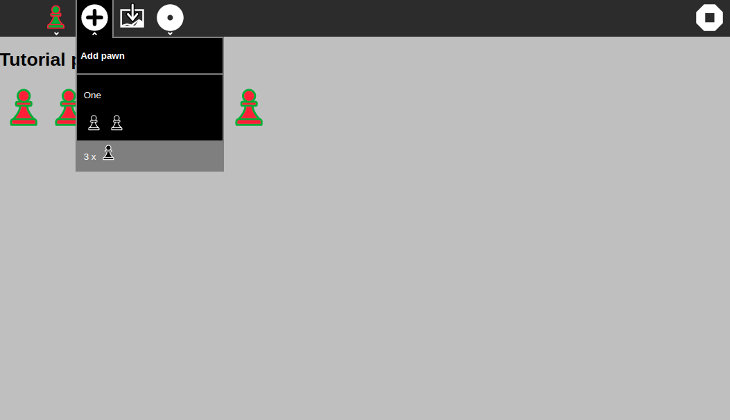
Open the palette by clicking on the **Add** icon.
Try to click on the first item, it adds one pawn on the board.
Try to click on the second item, it adds two pawns on the board and close the palette.
Try to click on the third item, it adds three pawns on the board and close the palette too.
That's exactly what we expected!
Voila! now you are able to create your own custom palette and how to add event into it. Note however that there are multiple ways to handle palettes. You could attach methods to the palette or generate its content using HTML generators like the included **Mustache** framework.
To learn more, I suggest you to explore the source code for other activities that use palettes, for example [Paint](../activities/Paint.activity) or [Speak](../activities/Speak.activity). You could study for example how the Color palette, used in multiple activities, works.
[Go back to tutorial home](tutorial.md)